Project Goal: To develop a cohesive, multi-channel advertising campaign aimed at combating biodiversity loss. The project required the creation of three complementary print ads, a mobile-optimized mock-up, and a high-impact web banner to drive public engagement and conservation action.
My Role: Creative Director & Lead Designer. I was responsible for brand naming, conceptual strategy, photo manipulation, and final layout execution across various digital and print formats.
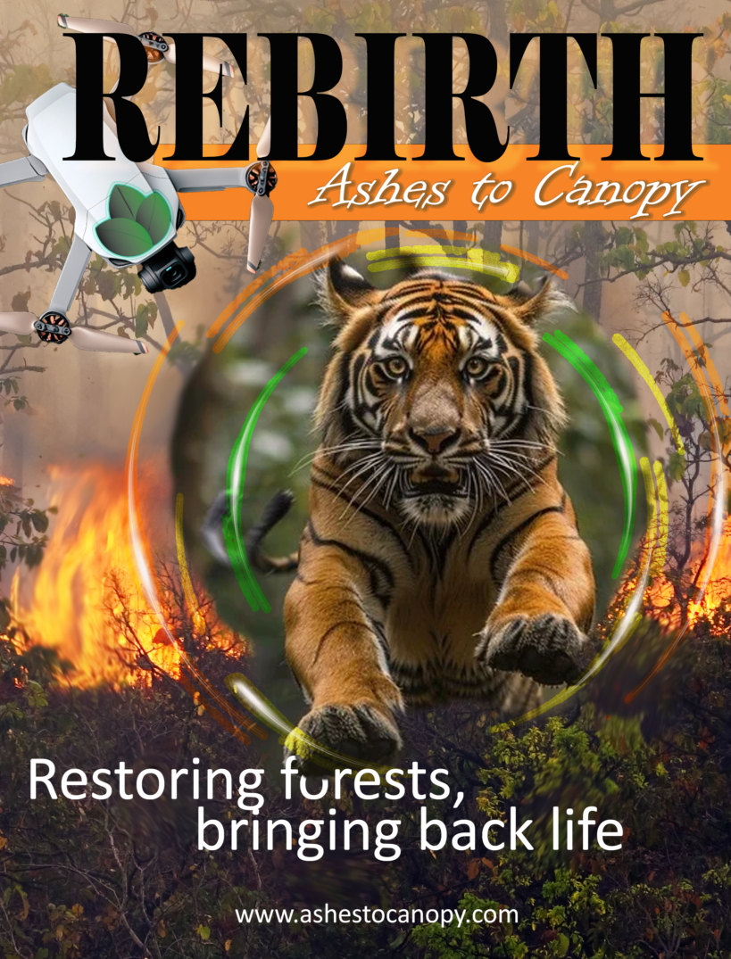
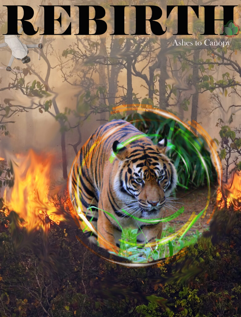
The Brand: Ashes to Canopy: The brand name, Ashes to Canopy, serves as a metaphor for ecological resilience. It suggests that even from the destruction of deforestation and fire (the ashes), we can rise to replant and restore the world’s forests (the canopy), providing a fighting chance for the flora and fauna that sustain global biodiversity.
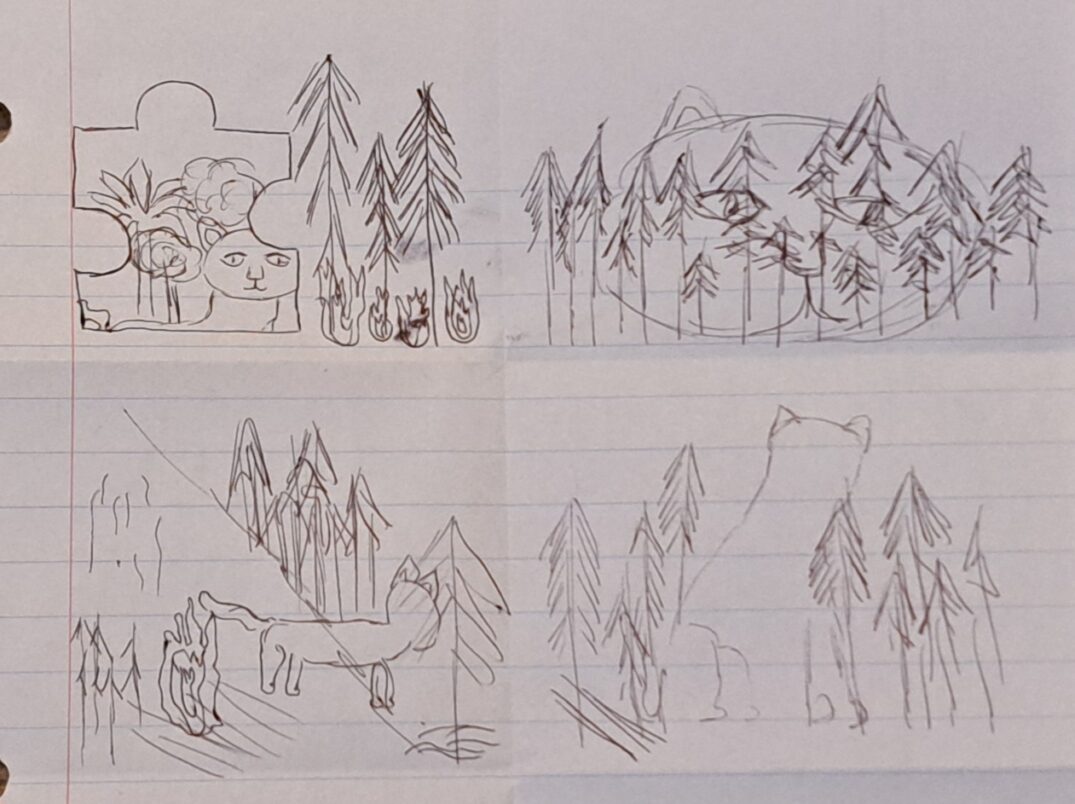
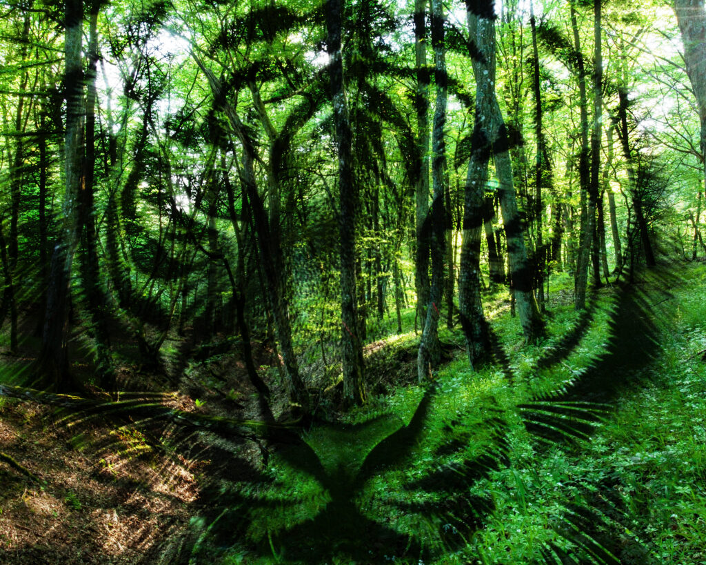
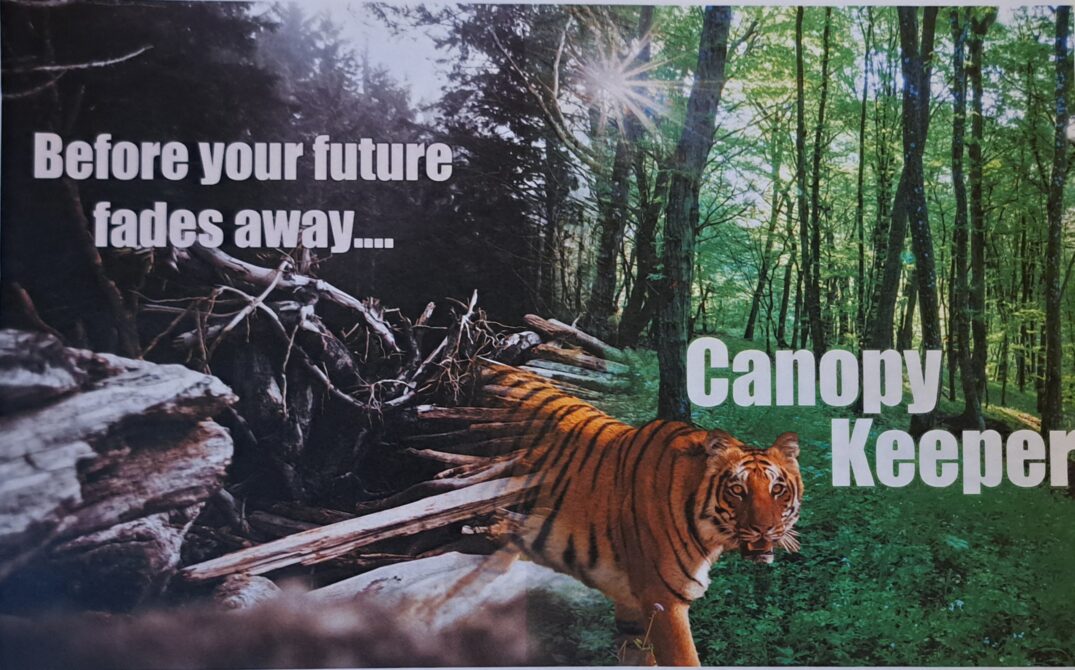
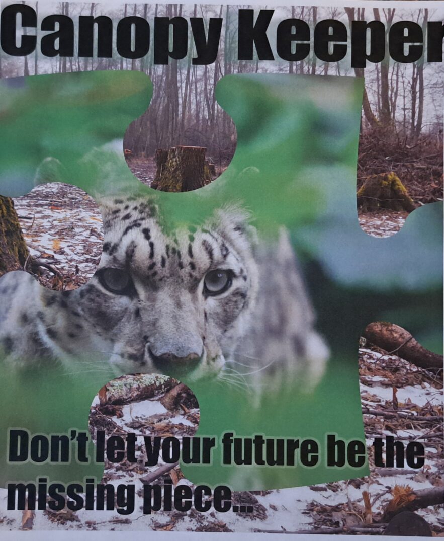
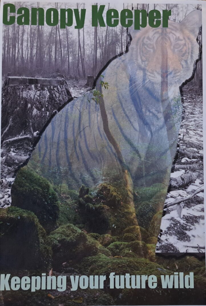
The Design Process & Evolution: The creative journey began with a series of conceptual iterations in Adobe Photoshop. Ideation: I explored four distinct creative directions, utilizing advanced blending techniques, double exposures, and gradient masking to create a “fading” effect that symbolized the disappearing nature of these species. The Pivot: While early drafts focused on various visual metaphors, I ultimately decided that a unified visual system would be more effective. I transitioned to a clean, cohesive layout that utilized high-impact animal portraiture to create an immediate emotional “hook.”
Execution & Technical Strategy: I selected three “ambassador” species—the Tiger, Panda, and Orangutan—specifically chosen for their high levels of human recognition and emotional resonance. Consistency: By maintaining the same layout, typography, and color grading across all three designs, I created a “serial” campaign effect that reinforces brand recognition. Platform Adaptation: I expanded the core creative into a mobile mock-up and web banner, ensuring the call-to-action (CTA) remained prominent and legible across different screen sizes and user experiences. Techniques: Used non-destructive masking, color correction, and sharpness enhancement to ensure the animal portraits felt “larger than life.”
The Result: A professional, heart-tugging campaign that balances the gravity of extinction with the hope of restoration. The final suite of ads creates a powerful visual narrative that prompts the viewer to transition from passive observation to active participation in global reforestation efforts.