Goal: To demonstrate the power of selective color in advertising by creating a visually striking “pop” of color within a high-contrast, greyscale composition.
My Role: Creative Director and Lead Designer. I was responsible for the initial image selection, digital manipulation, and the subsequent design of a cohesive multi-channel marketing campaign.
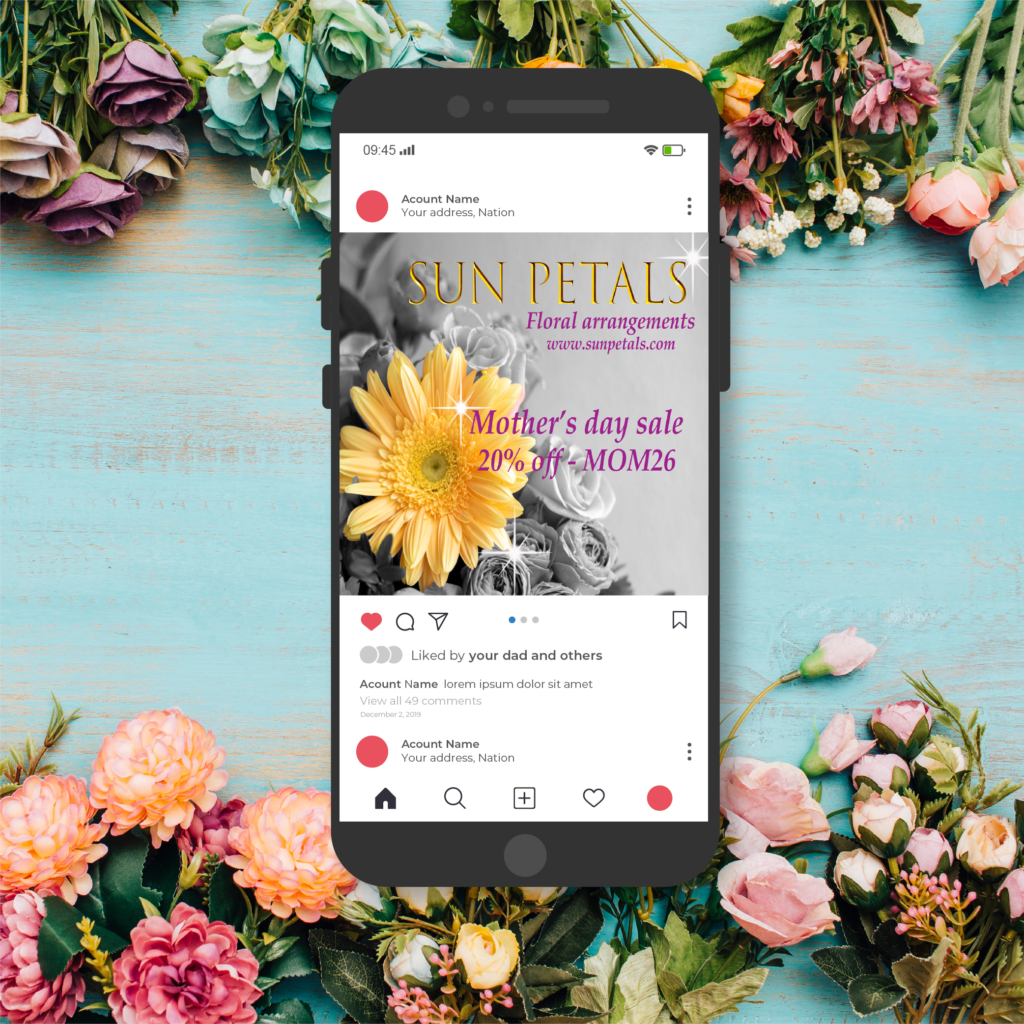
The Creative Concept: The core objective was to use a singular, vibrant focal point to break the monotony of a desaturated environment. I selected a floral arrangement because flowers naturally represent beauty and vitality—offering a visual “spark” that can brighten even the most mundane settings.
- Strategic Color Choice: I chose Yellow as the primary accent color. Known for evoking feelings of cheerfulness and optimism, yellow was used to create an immediate positive emotional connection with the viewer.
Technical Execution & Adaptation: The project evolved from a technical study into a comprehensive brand identity exercise for a fictional floral boutique.
- Selective Saturation: Using advanced editing techniques, I isolated the yellow tones of the flora while carefully neutralizing the surrounding elements to a clean greyscale. This created a clear visual hierarchy, ensuring the product was the undeniable hero of the shot.
- Commercial Application: I expanded the project into two distinct deliverables to showcase versatility: Large-Format Print: A high-resolution vinyl poster designed for storefront exterior advertising. Digital Marketing: An optimized social media ad tailored for high engagement and customer outreach on platforms like Instagram and Facebook.
The Result: The final result is a striking, minimalist composition that pulls the viewer in through high contrast. By pairing artistic flair with commercial intent, the campaign effectively captures attention in a crowded marketplace, leading the viewer from an emotional “spark” toward a direct purchasing action.